refresh app
January 20, 2014 · tags: apps
- next: CAC recap
- previous: maker projects round up
- return to blog
I made an iphone app out of this project that came out of an idea that struck me while I was writing notes for a lecture on net art (notes from class if ur interested).
I really love all that mid 90s stuff by Olia Lialina, Alexei Shulgin, Heath Bunting, etc. that uses weird forms, frames, and other html stuff to make funky art. I wanted to make a story that used buttons and had a non-linear narrative but was also in the style of more recent internet trends, the kind of stuff I was really interested in with 4chan, live journal, fan fiction and all of that stuff. So I wrote a 4chan/livejournal ish story that incorporates some elements of my life and made a really silly app that times out if the reader stays on one page too long. I submitted it to the app store (it was built on phonegap, I would publish it on gihub but the story is on the same pages as the code, so i probably will wait to see if Apple will actually publish it before I post that) because I actually think its kind of cool, also partly as a joke, and also as a bit of a challenge to see if Apple can be used as an art platform. There are some interesting artists books and other things that have been published as iPhone apps, but as far as I know there are no real works that exist only as apps. Without going on too much of a rant, I think the app store actually provides a great opportunity for digital art which has struggled to find a real market. The problem obviously is that showing digital art in a gallery makes little sense, because most digital experiences are meant to be between one person and a device. The gallery attempts to recreate this with a monitor or computer station, but the effect is not the same. The problem then with publishing things online as the early net artists did is that its impossible to monetize and if you think of art as a commodity it really raises the question of whether it is art at all (at this point reader begins to form a million counter points (the reader being probably no one) but lets just accept this for now and move on). But the apple store is very secure and regulated and App piracy isn't a thing the way it is with mp3s or books or movies.
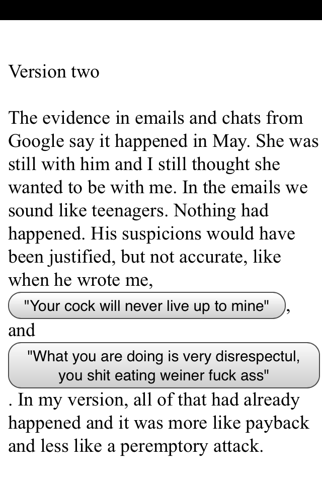
I had doubts that Apple would even consider an app that consisted of plain text, buttons and a kind of crude story, but the first review of the app (which was rejected as I expected) contained only one "error" which was the following screen shot:

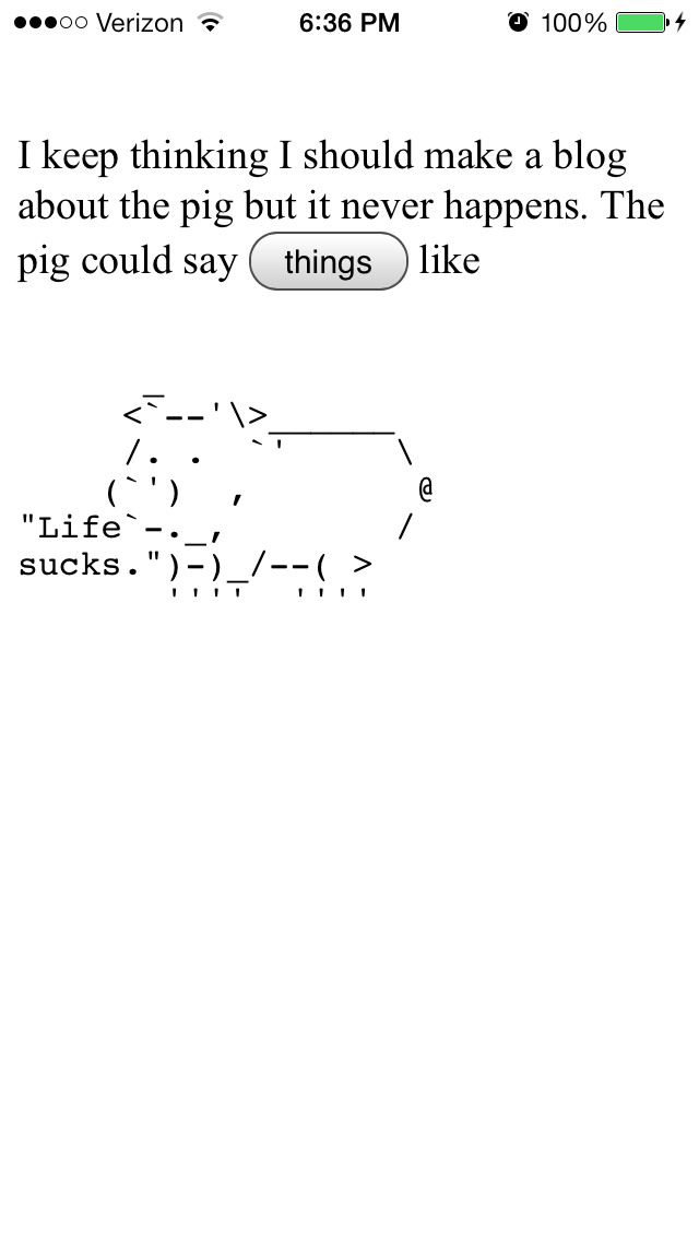
This a page from the app and its pretty clear why Apple found it unacceptable to publish. But this was the only thing they sent. There's plenty of other instances of bad language and stupid things like this:

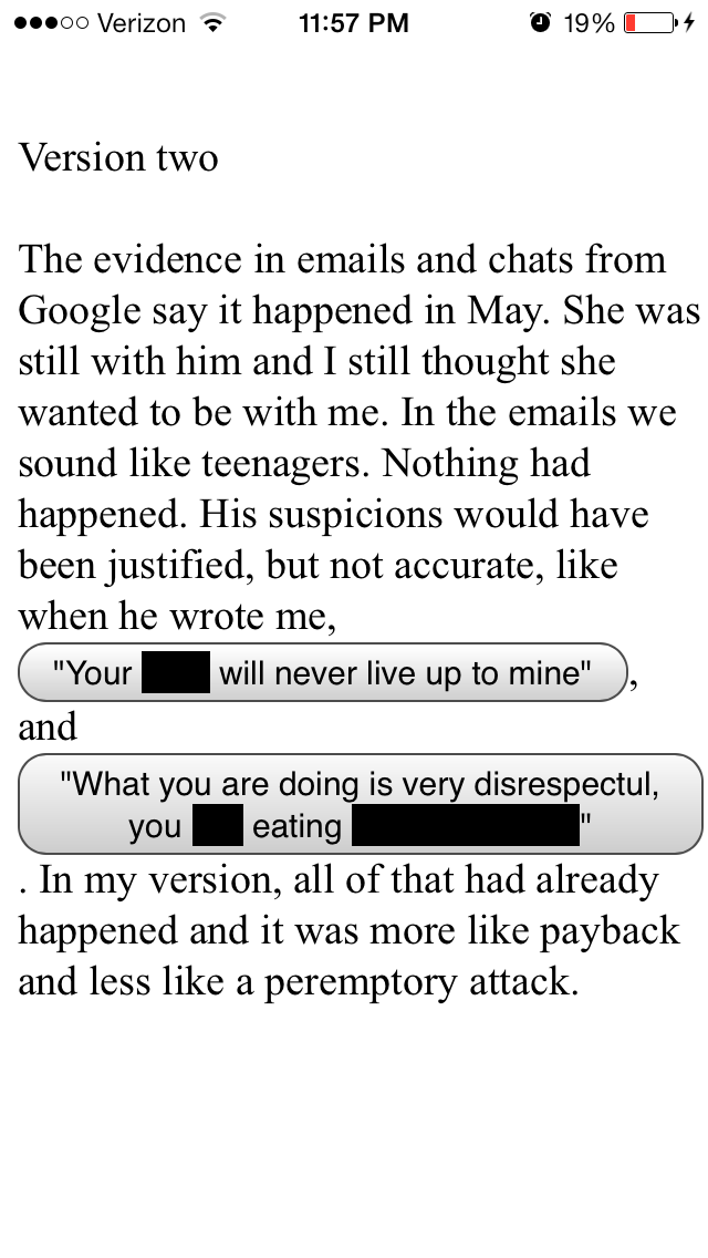
So I don't know if they just sent it back immediately upon finding one instance of bad language and will continue to do so one at a time, or if that was the one thing that they found wrong with it. I will find out hopefully this week. After contemplating various ways to deal with this I decided on this:

So that might be considered a little annoying, since I'm pointing out the sort of sensorship that Apple is doing, but I don't really mean it as a political thing. I think its perfectly reasonable for Apple to not want to publish things that sound like porn, and I sort of think that a person didn't even find this error, because the sentences probably just sound like porn and got picked up by some filter (though it is really funny to me to imagine the review guys at Apple having to play my app and probably thinking its really dumb and also to imagine this as an art piece made only for the Apple app review department). But ultimately I decided that this gets rid of the bad words and leaves the text ambiguous enough that innocents won't know what it means but adults will be able to fill in the blanks pretty easily (though possibly not with the word "wiener").
We'll see what happens. If it gets rejected again I'll just change the wording. This particular page was actually pretty important to me because its the grossest page in what is otherwise a pretty tame app, and its really meant to make the reader realize how stupid and gross the whole story is (not my telling of it but the story itself, the circumstances of the characters and their personalities) and I think it does a good job because its the thing that embarrasses me the most to have written, which I usually take as a good sign.
It's also important to me to see if this gets published by Apple because I've spent a lot more time developing a more robust app and wanted to see what Apple was going to do with this sillier one before I submit the next one.
- next: CAC recap
- previous: maker projects round up
- return to blog